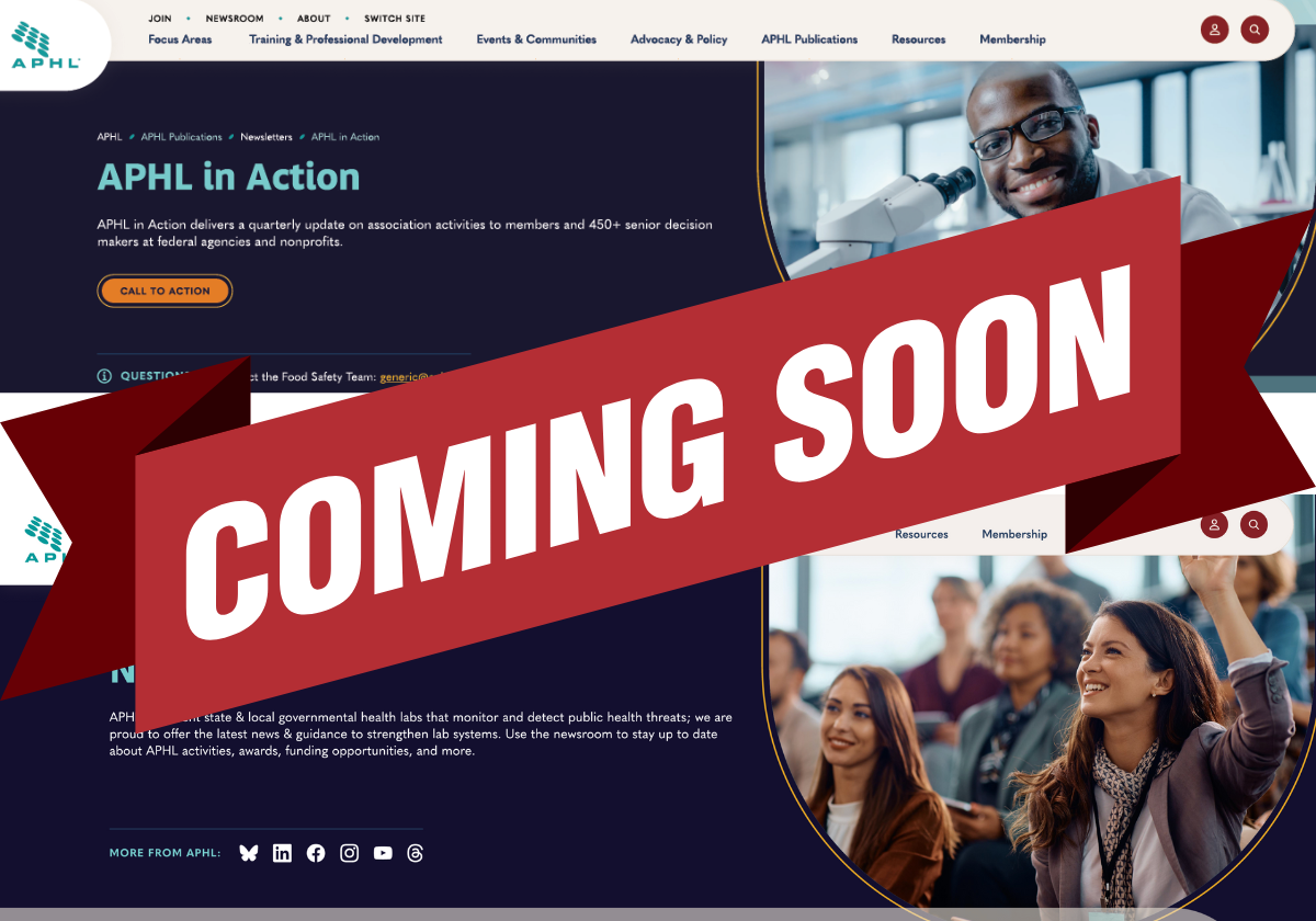
APHL’s New Website Launches Soon. Here Are 5 Things We’re Excited About!
APHL.org, the organization’s website, first launched roughly 30 years ago. In those three decades, there have been a few overhauls, but nothing like the extensive redesign now poised to make its debut. It’s the website’s first redesign in 10 years, 10 years marked by significant growth in APHL membership, a worldwide pandemic, dizzying advances in laboratory science and new creative developments in the world of web design.
To determine how to make a new website better, the core redesign work group, led by APHL’s Madeline Rooney, senior specialist, Communications, embarked on a two-year assessment period. Members, partners and staff were surveyed, interviewed and invited to test new aspects of the website to judge its usefulness.
“We aren’t just moving from one website to another,” Rooney emphasized. “It has been completely rethought and redesigned. Every change was made with a purpose and was based on data from users. For example, we asked members how they look for data and how they’d like to see things organized, and what names make sense. The redesign was very intentional and has users in mind.”
The newly revamped APHL.org is scheduled to launch in early spring, just in time for APHL’s 75th anniversary celebrations. We sat down with Rooney to ask what she’s most excited about in the new website. Here’s what she had to say:

1. A user-friendly interface
One of the biggest critiques of the old website was that it was difficult to find information, Rooney said. “Users felt strongly that we have really good information, but it was hard to find. Some of the material is restricted, and people were confused about how to get access. Or sometimes you couldn’t see information unless you were logged in. So, a lot of what we did with the new website was renaming and reorganizing things to make it easier to find information.” And a huge help, said Rooney, will be a very capable search function. Type “tuberculosis,” for example, into the search bar and everything pertaining to that subject—trainings, videos, webinars, publications, blog posts, etc.—will show up. “Even if you have no idea where the information you’re looking for lives on the website, you’ll still be able to find it,” Rooney commented.
2. Increased visibility for publications/communications
Looking for APHL blog posts or Lab Matters articles? The new website will have an APHL Publications header, allowing you to navigate to all blog posts and Lab Matters articles. “Right now, we only highlight a couple of key blog posts or podcasts on the website and the feature article from the current Lab Matters,” Rooney said. “But the new website will make all these publications searchable. We’re really excited to increase the visibility of these communication platforms.”
3. Easier to read copy, easier to find resources
The new website will lean heavily into text divided by headers, subheads and bullets—all with the goal of making information easy to find and scan. Additional information, such as a resource’s description, will expand with a click, keeping the page uncluttered yet still helpful. Another prominent feature? Enhanced navigation within the pages. Every page will have both an “On This Page” list of headers and links to “Related Pages” in the sidebar. “The ‘On This Page’ list is like a table of contents,” Rooney noted. “It will give users an overview of the page’s topics and allow you to jump deep into the content without having to scroll through the whole page.”
4. A better mobile experience
Copy and images won’t simply shrink when viewing the website on the smaller screen of a phone or tablet. Everything will automatically realign and readjust to the screen’s size, so viewing will be fluid.
5. A more vibrant, friendlier look
One of the aims of the new website was to make it warm and welcoming—and you’ll notice that in the choice of images, graphics and color palette. “It will still look very much on-brand,” Rooney said. “But with an interesting format. There will be a lot more images, a wider use of colors and everything will look very friendly and engaging. We are first and foremost a community, and we want our website to reflect that feeling.”